SM Supermalls
Bringing the Philippines’ largest mall chain’s offerings to savvy mall-goers.
Corporate
Modular design system with the foresight of future products
To convert Cebu Pacific's remaining offline users who use physical ticket offices to book tickets through a digital experience, using channels aligned with the brand.
A self-service tablet kiosk that will be placed in their ticketing office and a design system that can be translated to multiple online channels.
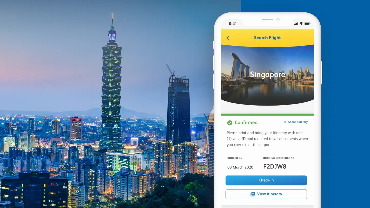
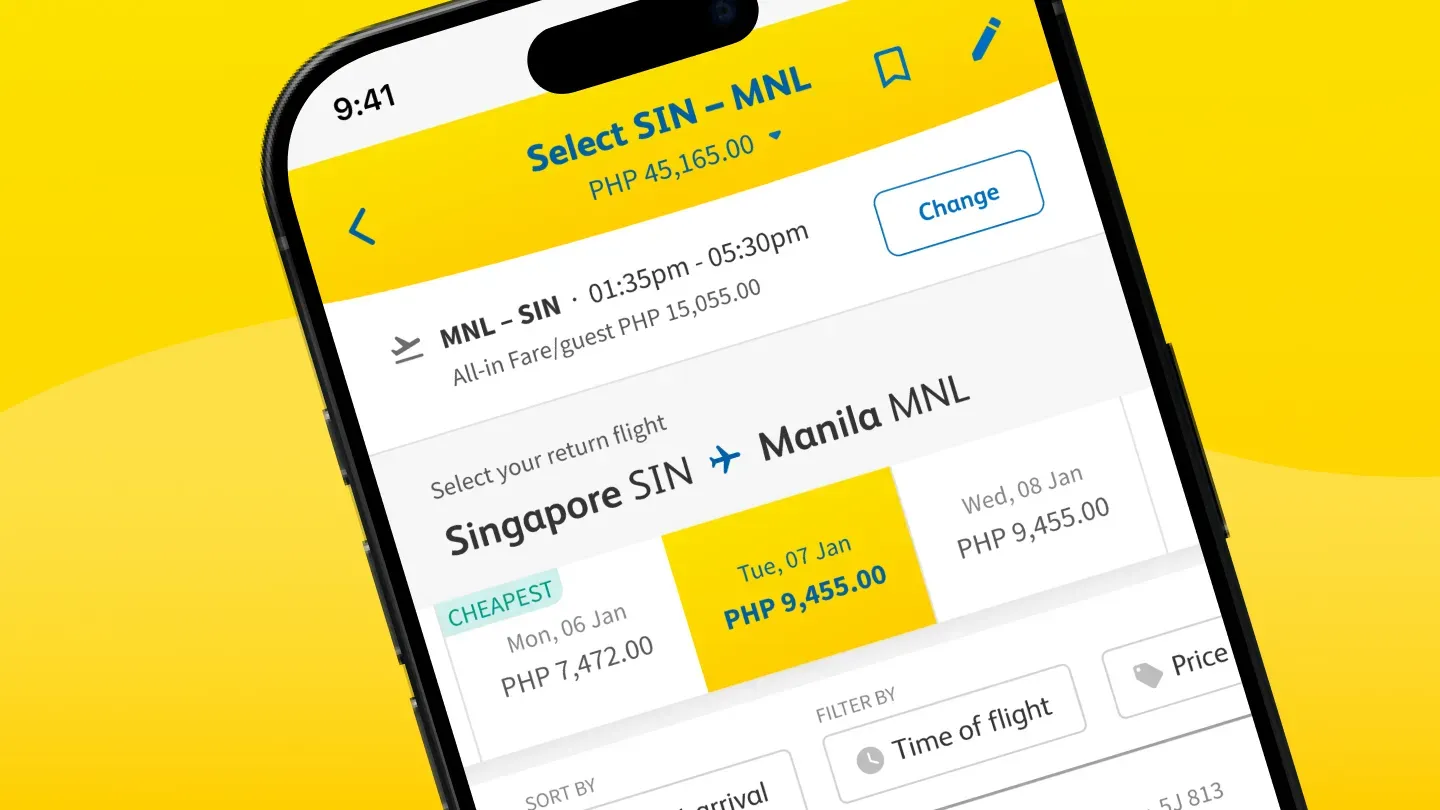
Recreating the user flow and interface of Cebu Pacific’s mobile app is a foot-in-the-door strategy that we used to ease users who are not yet comfortable with the digital experience into using the kiosk.
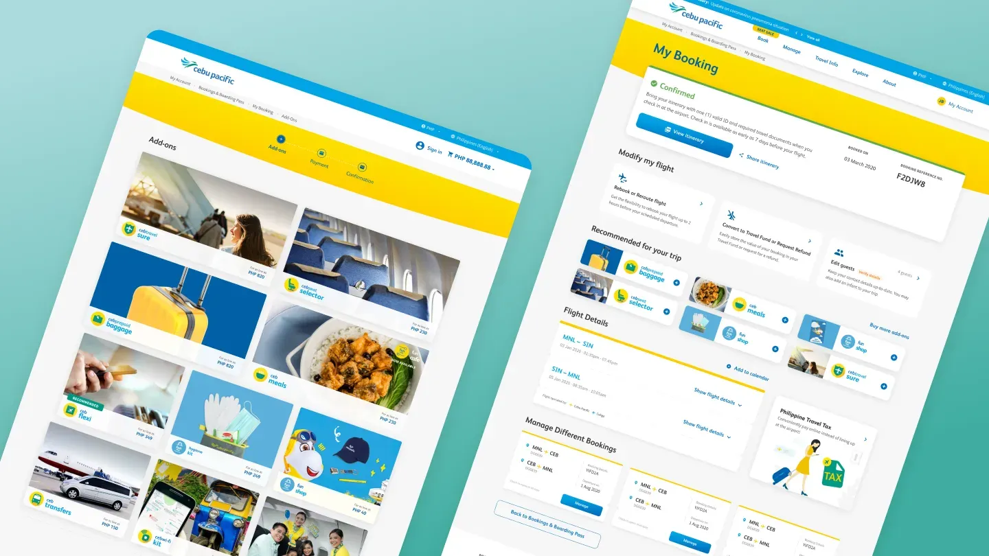
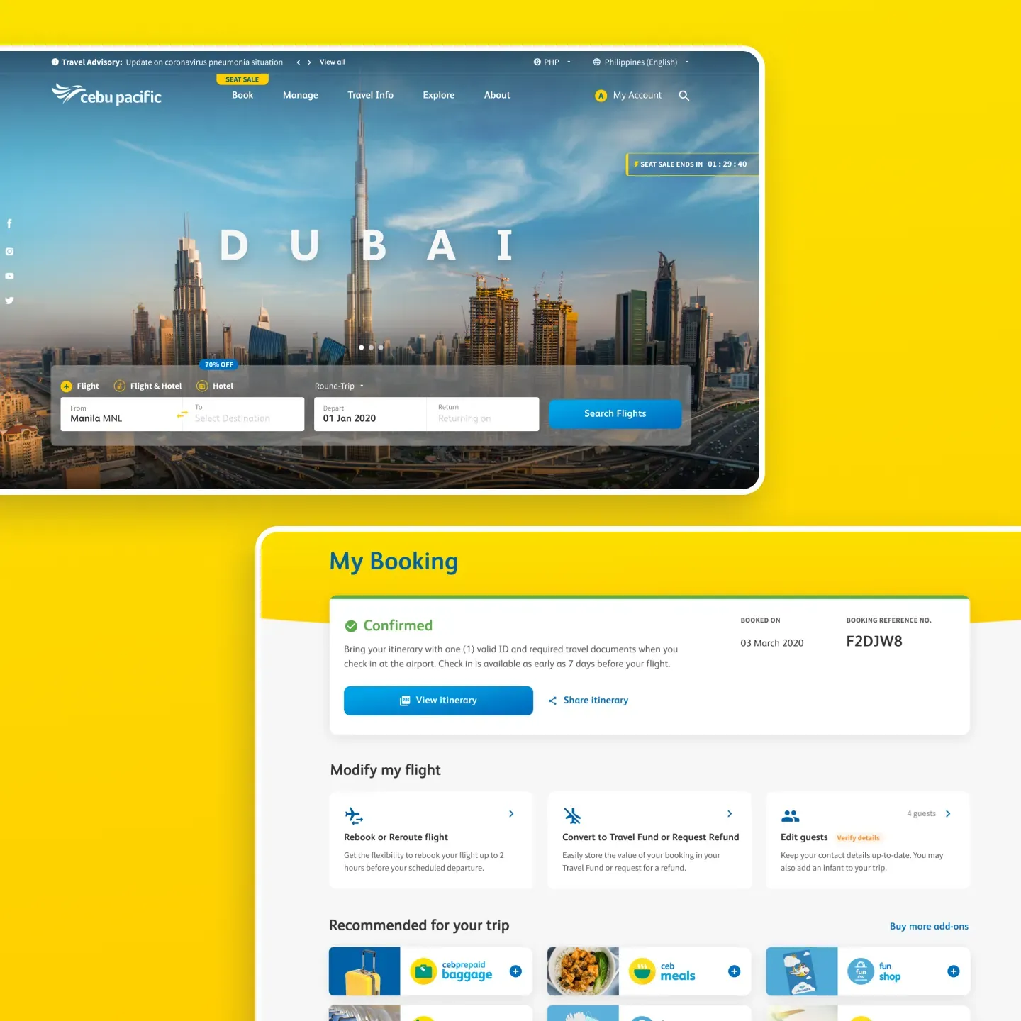
Cebu Pacific’s current branding elements served as building blocks for the design system that we created. Scalable and responsive designs create a consistent look and feel across the different channels that they use.
Prototypes are effective storytellers, so we worked closely with Cebu Pacific’s developers to see the product come to life. This was unveiled at Cebu Pacific’s product launch, garnering positive reviews from the press and media.
Over the following year, Make has also served as the UC Agency of Cebu Pacific, improving the UC of their e-commerce platform, creating prototypes for usability testing, and working hand-in-hand with their team in driving innovation for the brand.
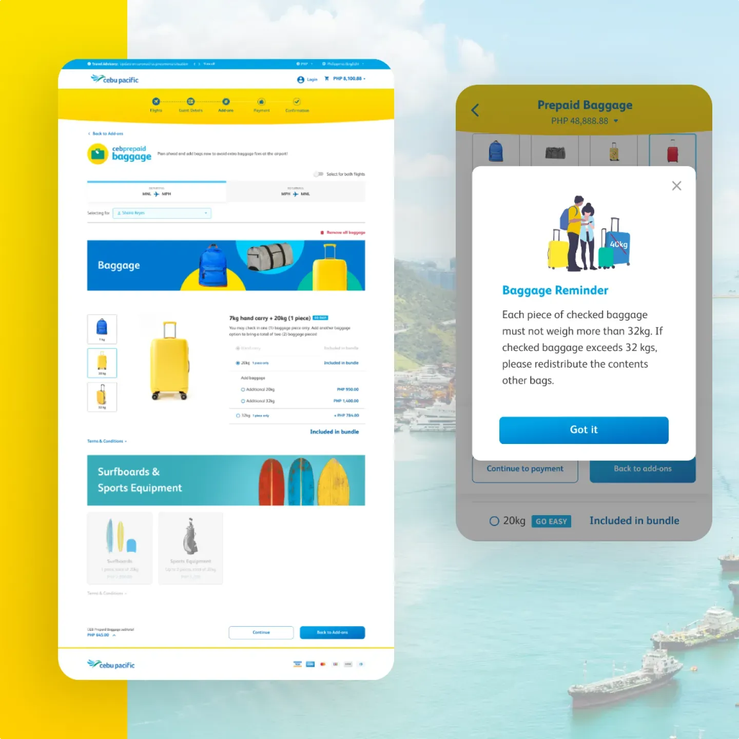
To ensure that designs will remain consistent, we took the initiative to create a design library that details all the necessary styles for all the user interface components.
