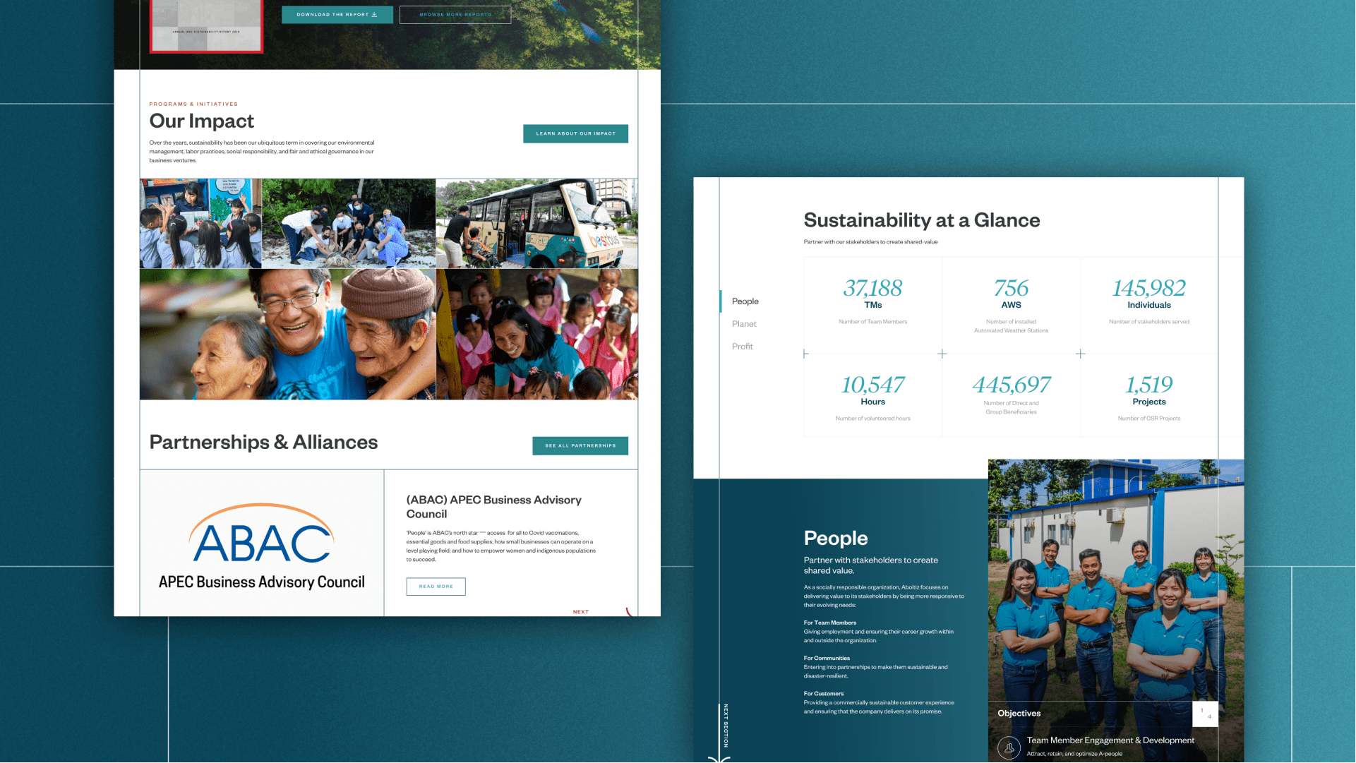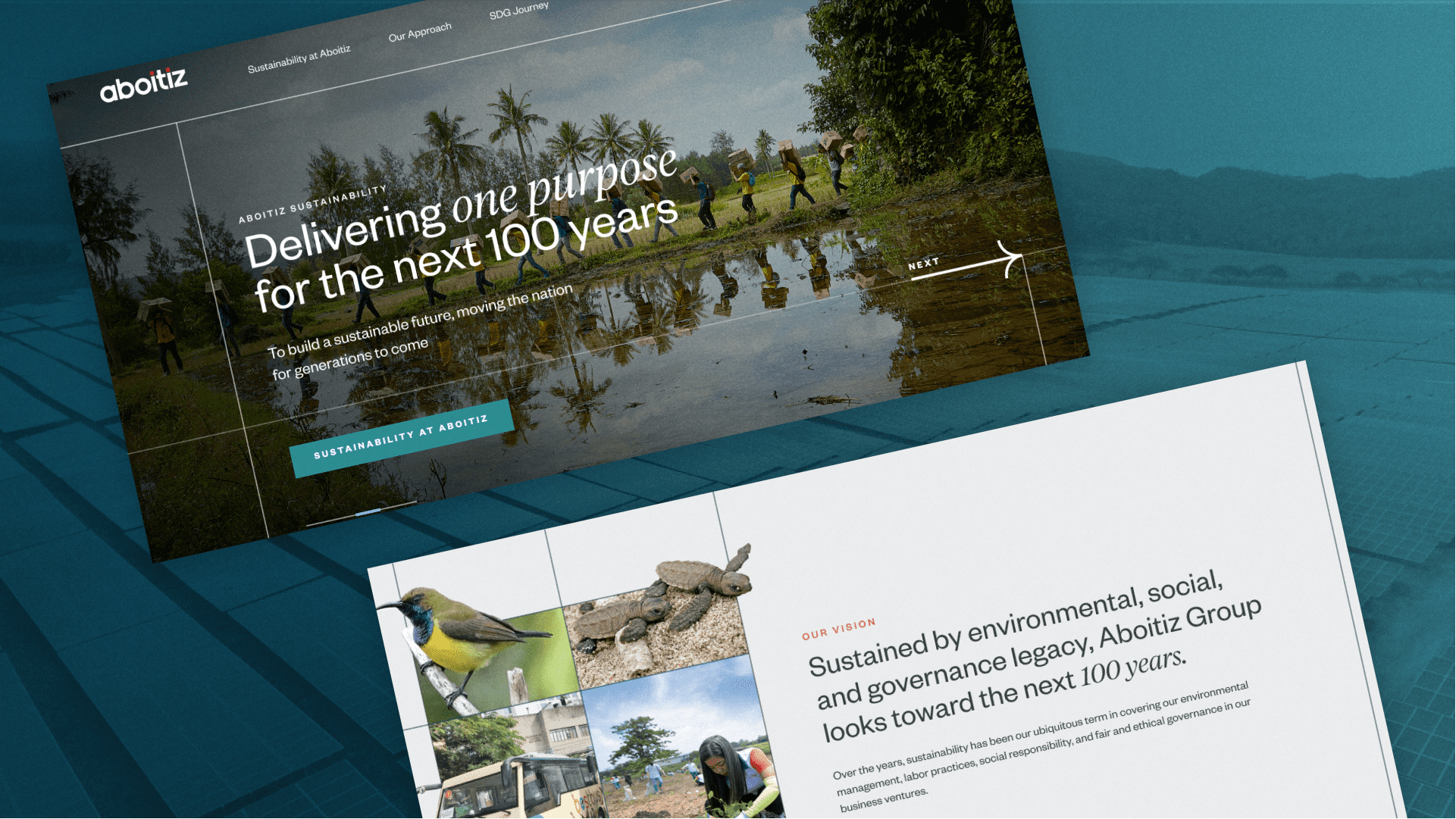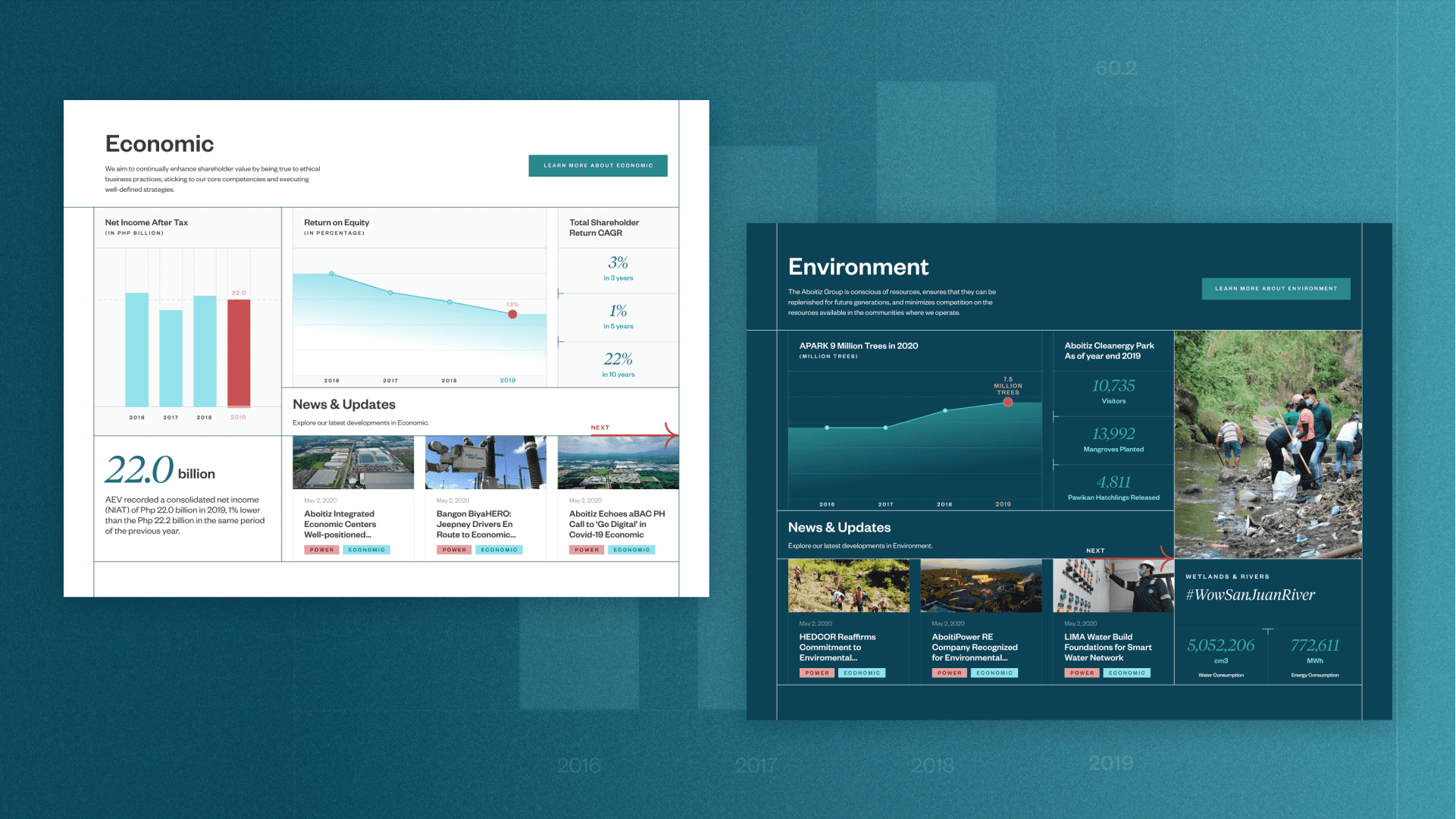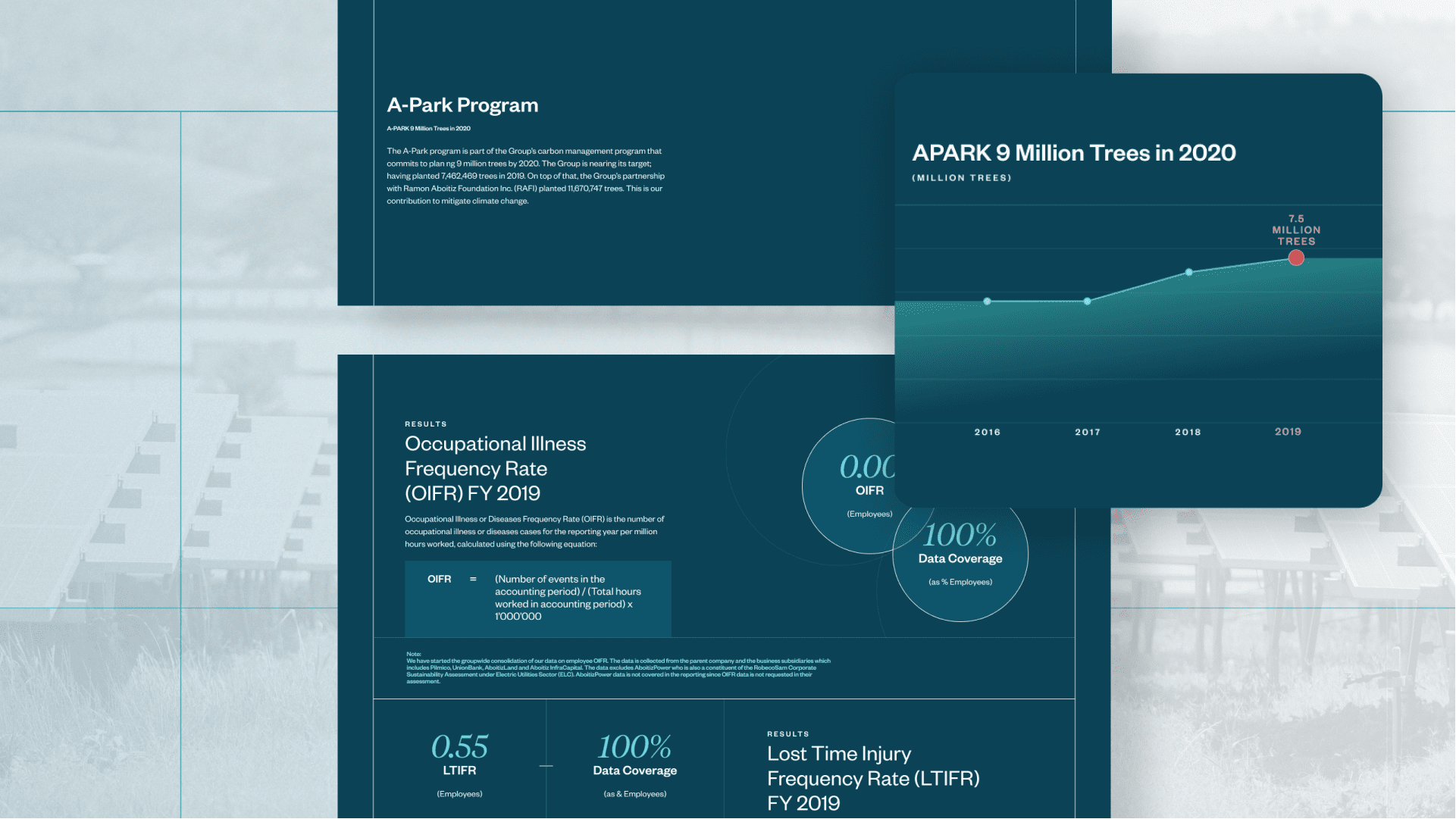
Designed to Cater for a Diverse Audience Group
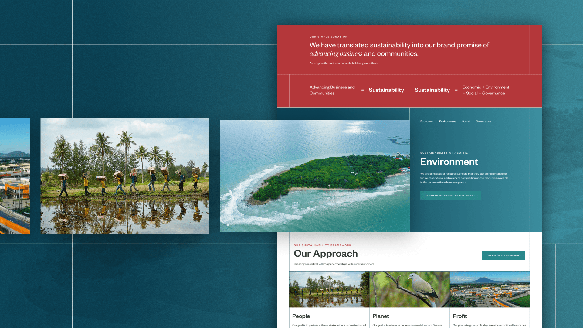
At the onset of the project, we first defined the various audience groups and their categories through intensive UX Research and Strategy in order to anticipate how the website should be created with their interests and objectives taken into consideration. With this information, we consciously crafted the visual and functional dimensions of the website’s experience. We generated foresights based on the various flows and scenarios where users enter and explore the site. This affected how we thought about the content structure and the presentation of information across pages and sections. As such, a collection of modules, which acts as flexible content blocks, was created to be rearranged across different subpages to serve user needs.